






ShadowVFX
February 14, 2026
UI Needs a lot of work
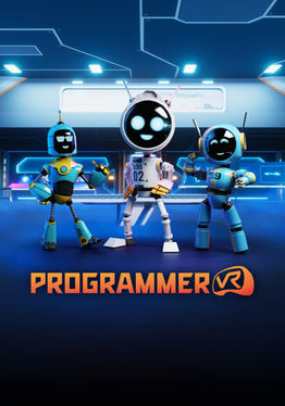
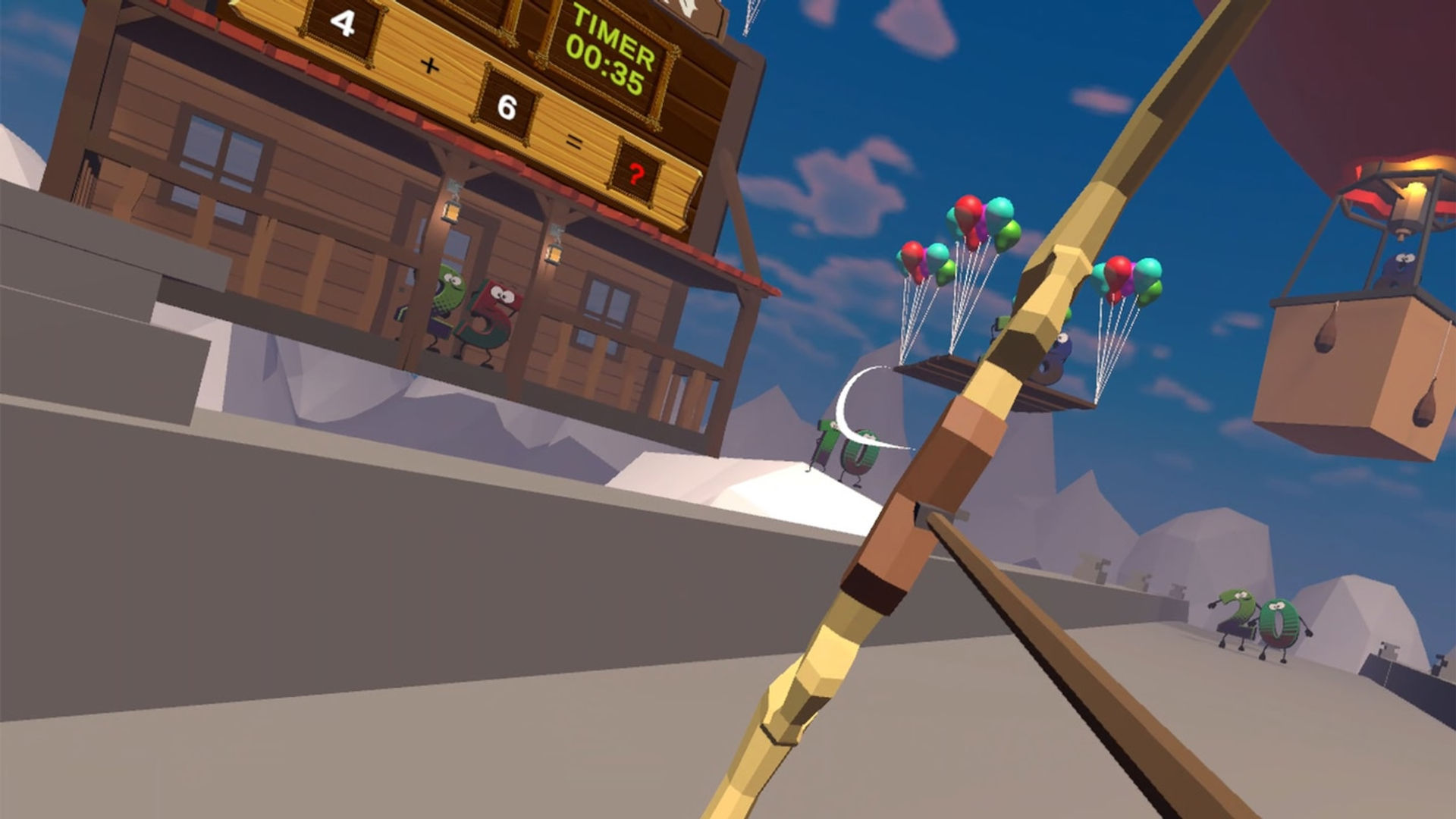
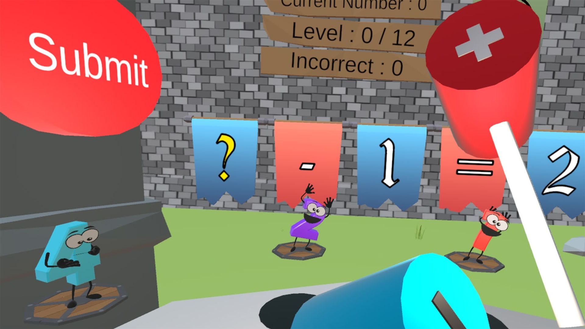
I got this for my kid to practice letters and numbers, but the UI is awful for someone who can't read. There are no pictures, icons or anything else "infographic" to help someone without knowledge of the english language navigate the menu. If this is intended to be a learning game, then there should be easy icons next to each selection to denote what that selection is for. Number Whack could have an icon to the right of the button showing mallet hitting a number. Same for the archery minigame. I'm disappointed, because I think my kid would love this, but I keep having to take the headset to select things for her because she doesn't understand the UI and the buttons are (relatively) tiny for a young person to press with reliability. Again, devs, if you are reading this; study up on UI design. There is so much you could do to reduce the barrier for your players. In response to the Devs reply: My child is 10, but is autistic and I am using the headset to help her learn letters and numbers better. But, none of this matters because my critique is still 100% valid whether it is played by an adult or a kid. Your UI needs work. Instead of getting defensive and trying to dismiss the criticism, take it to heart and study up on UI design so that you can make a better experience. The core experience here is solid. But for a game targeted at younger users for "education", the UI should be a lot more universally understandable by all kinds of people, regardless of their first language, nation of origin, or their current education level.
9 found this helpful